

Project X #6 ~ Building an Interactive Data Analytics Dashboard
Learn to breathe life into your data by building a fully interactive data dashboard with the Dash framework using Plotly, Pandas, and Scss/Sass.

Welcome to this month’s edition of Project X—, where we dive into a building an Interactive Healthcare Data Dashboard! Every month, we'll take a deep dive into Python-powered projects. We'll break down the code together, see how it works, and explore how it can be used in a real life project.
My mission for Project X? To empower you with the tools and knowledge to unleash your creativity and build impactful, real-world solutions using Python.
I am beyond excited to bring you guys this new project! This month, we will build a hands-on interactive data dashboard covering crucial aspects to bring your data to life through a web application.
By the end of this project, you'll have a comprehensive understanding of how to create dynamic, responsive, and user-friendly dashboards in Python using the popular Dash framework, Plotly Express and styling with Sass/Scss.

Welcome to Project X – where dreams meet code! Dive into creativity as I guide you through the creation of a captivating project, step by step, in each monthly edition. From conceptualization to execution, Project X empowers you to master Python while unleashing your creativity. Premium readers can recommend projects at the bottom.
This special monthly article builds perfectly with my ongoing series on Data Analytics, I aim to create projects that build on your current skillset and what I am covering in my writing.
This is the opportunity to take those basic visualizations from MatplotLib and pump some real life into them, give them a heart beat. I will take you from A - Z breaking down each step so you can get started building your own dashboards today!
I’ll cover the aspects of web design as we will use Bootstrap and HTML design the page, then move into Callbacks for your app. You can think of a Callback as an interactive action when something happens on your dashboard.
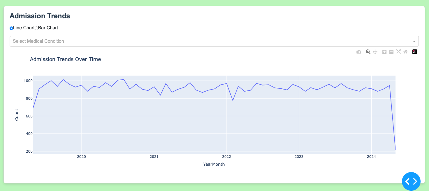
This dashboard was far complex to include in a single picture to showcase for you all so I had to split it up into a few images here below. You can see below that this project will encompass many tactics and interactive tools to manipulate your data live within the application.

I write with the purpose of you in mind, creating content that breaks down all that jargon into terms you can easily understand. These projects are just a little piece of that!
These projects take a lot of time and resources for me to craft in a way that I can present them and share them for you all. If you find value in my work please do consider becoming a premium reader as this helps keep The Nerd Nook alive!
👉 If you value projects like this one, please leave it a ❤️. This helps more people discover these projects, which helps me out and shows me you enjoy content like this!
👉Access the dataset used in this project in the next section
👉Premium readers can recommend projects at the bottom
👉 Access my Source Code for all Projects at the bottom
Okay, enough said! Let’s get into the fun and start building this months project!
